 Design
(03) DESIGN CASE STUDY · BRAND IDENTITY
Dunton Bassett Removals
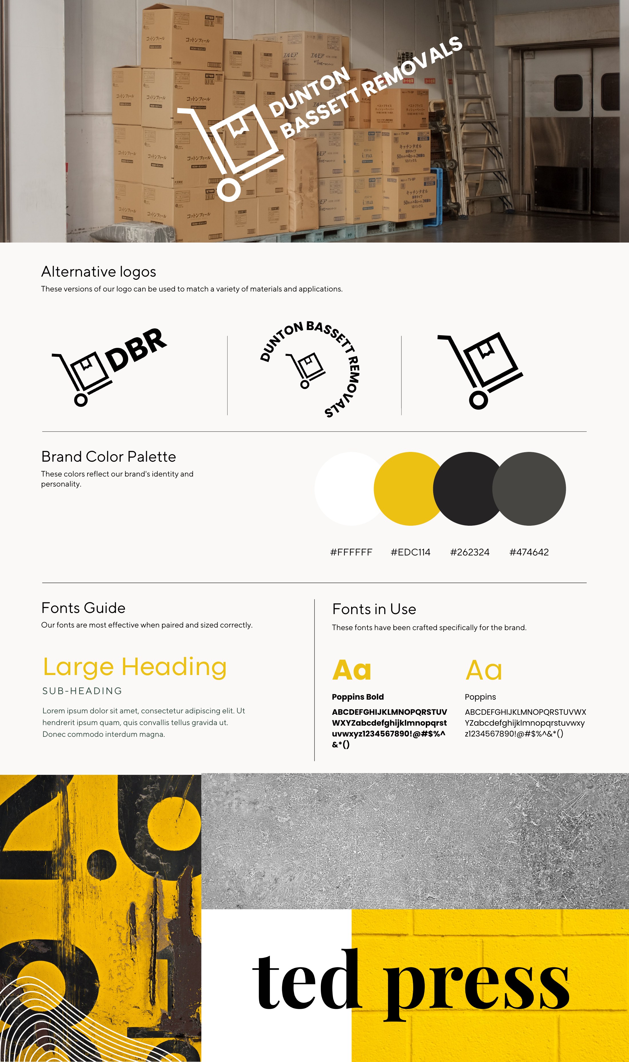
A bold, hard-working brand for a removals company.
THE BRIEF
Easy to spot on a van, easy to remember.
A sack-truck-and-box mark, a confident yellow against charcoal and a clean, geometric typeface.
A short DBR version and a round badge sit alongside the full logo, so the brand holds up on vans, boxes and social.
THE BRAND BOARD
Every piece, on one page.
COLOUR
TYPE
CONTACT
Let’s make
something.
Thanks, %%NAME%%.
Your message is with me. I’ll be back to you personally within 24 hours, and there’s a confirmation on its way to %%EMAIL%%.
Graphic designer based in Nuneaton, covering Leicestershire, Warwickshire and the whole of the UK, including Nuneaton · Hinckley · Leicester · Lutterworth · Market Harborough · Loughborough · Coventry · Rugby · Bedworth · Warwick · Leamington Spa · Atherstone · Tamworth.